Old Boy BBQ
Scope:
Visual identity, website, and packaging
Inspiration
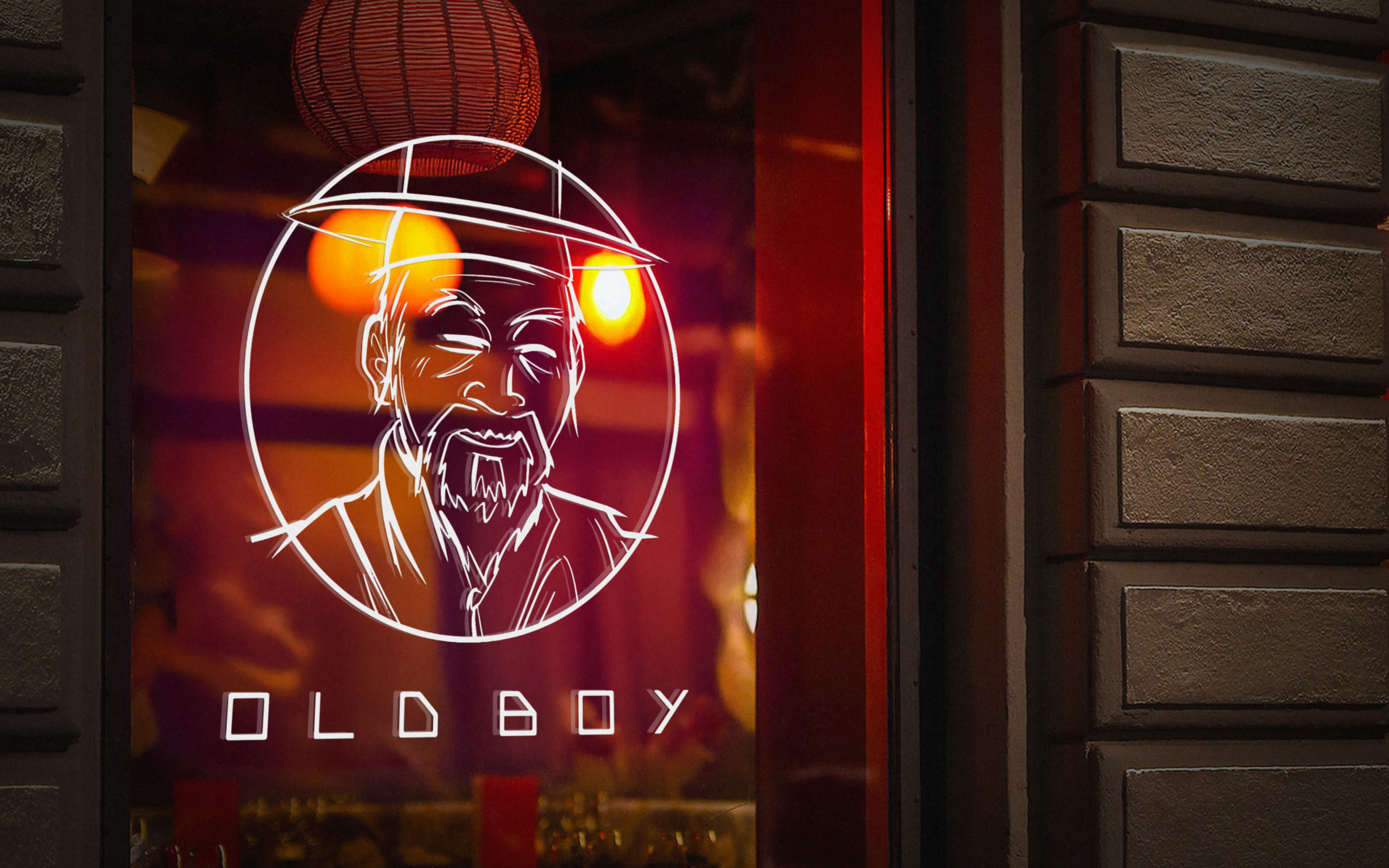
Old Boy BBQ opened in the center of Helsinki with a menu that fused Korean barbecue techniques with local Finnish flavors. The brand needed to feel bold and social, something that could stand out in the city’s food scene while staying approachable for everyday guests. The visual direction drew from classic Korean attire, especially the magoja coat and wide gat hat. We translated this into a hand-drawn elder illustration that set the tone for the identity. It was one of those rare cases where the logo came first as an illustration, then grew into a complete system. The goal was to keep the essence of Korean tradition while adding a Nordic twist that made it playful and welcoming.

Design Process
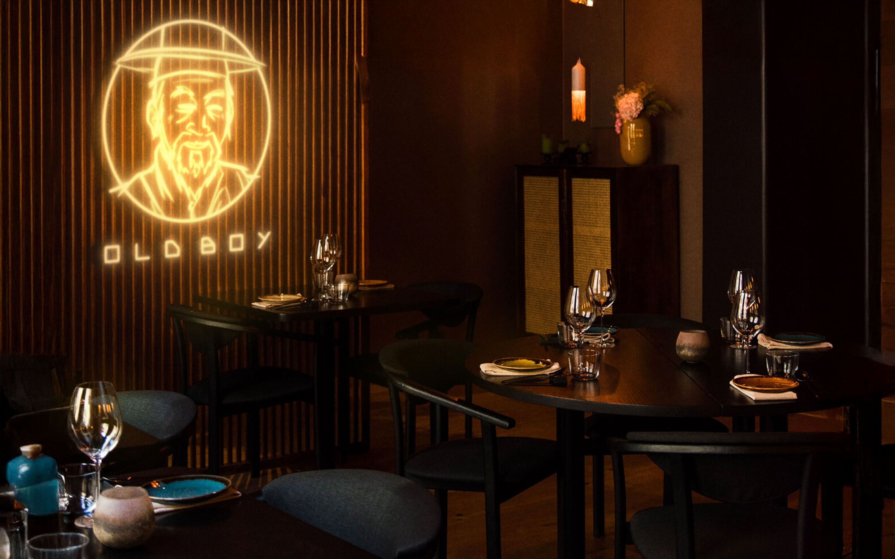
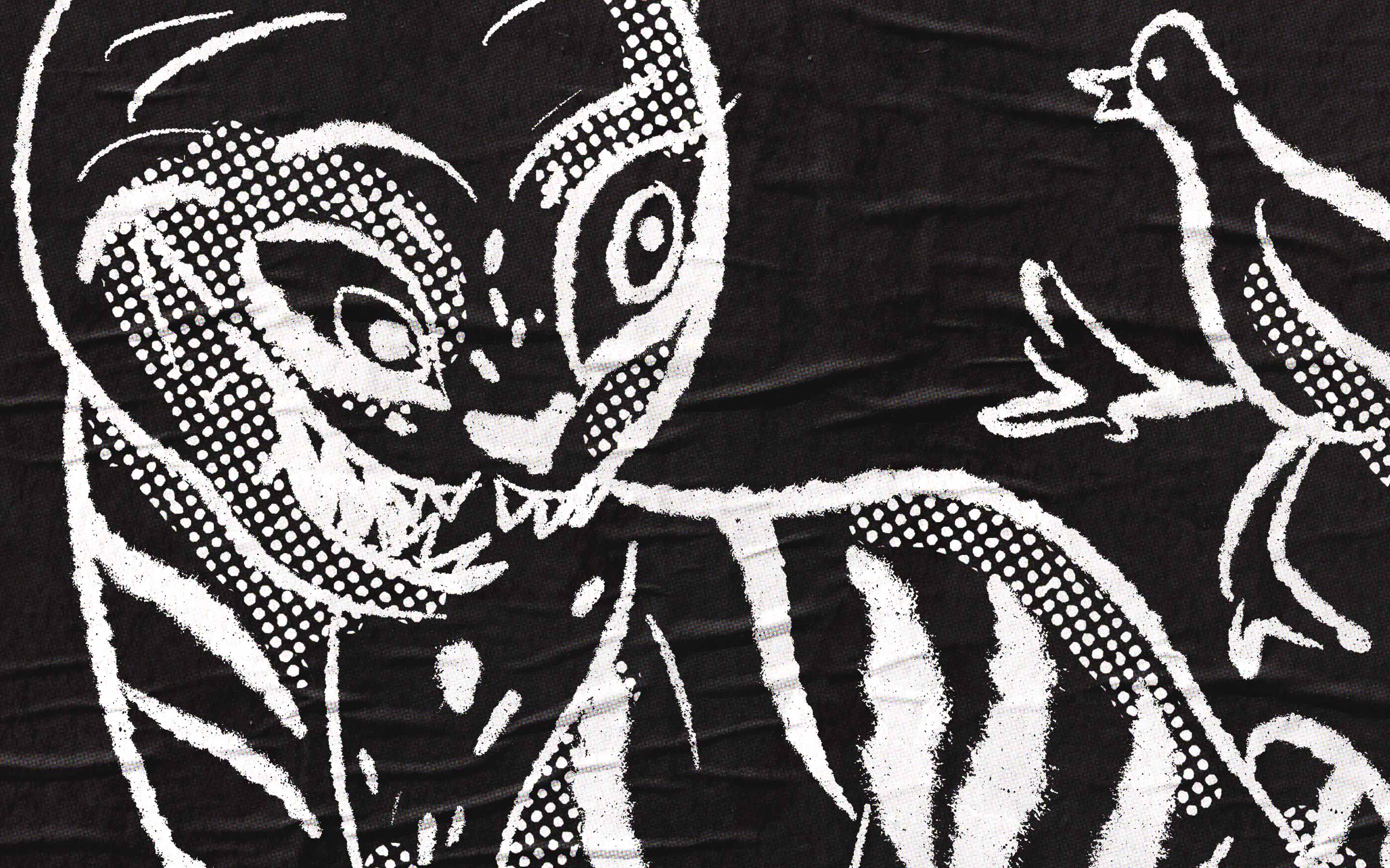
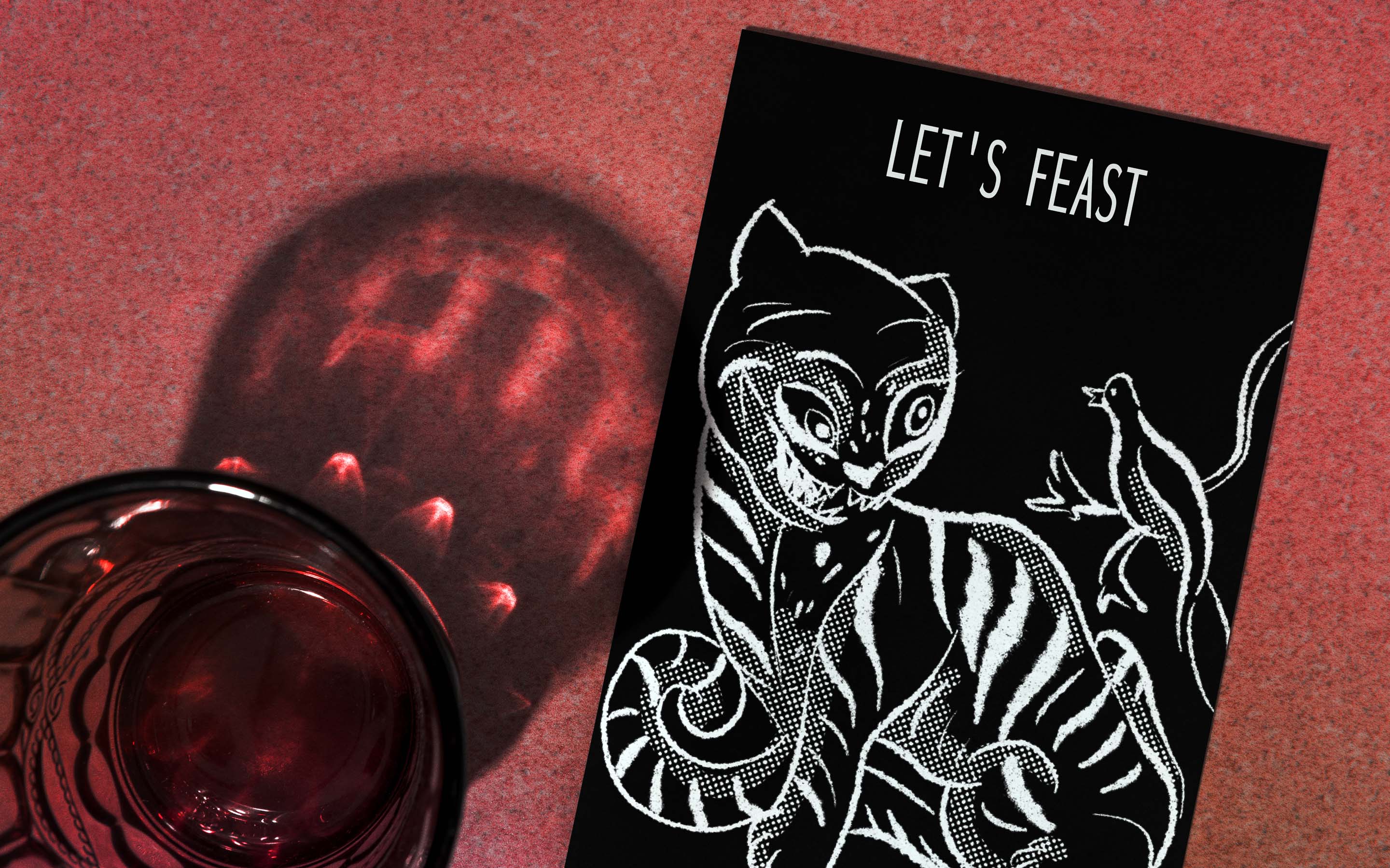
The elder illustration became the foundation of the identity. His expression and hand-drawn lines gave the logo both humor and character. The linework was kept loose and expressive to match the free-hand direction the client wanted. From there we built a system that extended the illustrated style into menus, packaging, take-away materials, and social templates. Color stayed simple with charcoal, off white, and Gochu red. Typography combined bold grotesk headlines with a clean sans for menus and web. The result is a fusion identity that respects tradition while embracing a modern Nordic clarity.
Logo Concept
The logo is directly influenced by the old Korean reference look, with the elder in gat and hanbok as the main mark. The brand extension also leaned heavily on illustration. Menus, packaging, stickers, and in-store graphics were designed as a set of supporting drawings that carried the same loose and playful tone across every touchpoint.


Made in Helsinki
Menus, vinyls, stickers, packaging, and social templates were all designed for daily use. Photography supported the illustrated world with close, tactile food shots full of steam and texture.


Experience
The identity rolled out across menus, packaging, window vinyls, and social templates, all designed for everyday use in the restaurant. Photography supported the illustrated world with close, tactile food shots full of steam and texture. The same approach shaped the website, built to be fast, visual, and mobile friendly. Menus, hours, and booking were kept one tap away, with a sticky bar on mobile for Book, Call, and Menu.

Korean fire, Nordic clarity.
Old roots, new form.


